Just like the cars themselves, logos have undergone significant changes over the years, reflecting shifts in design trends, brand values, and technological advancements. Let’s take a closer look at how some of the most iconic car logos have transformed over time.
Tracing the Evolution of Classic Car Company Logos
Many classic car logos have roots that stretch back decades, sometimes even over a century. Take Ford, for instance. Their iconic blue oval hasn’t always been the sleek, simple design we see today. It started as a complex, ornate emblem in 1903, gradually simplifying over the years. The current design, introduced in 1976, has become a symbol of reliability and American automotive heritage.

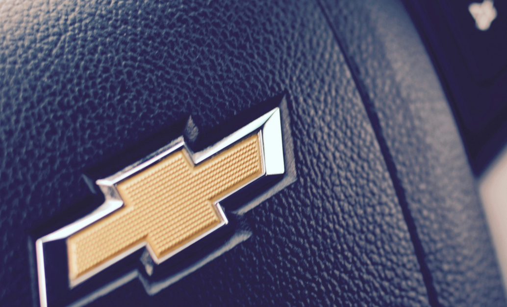
Similarly, the Chevrolet bowtie has seen its fair share of changes. Introduced in 1913, it’s gone from a slim, elongated design to the bold, gold emblem we recognize today. These evolutionary changes in car logo designs aren’t just cosmetic – they reflect the changing values and aesthetics of each era in automotive history.
Analyzing Major Car Logo Redesigns and Rebrands
Some car logos have undergone more dramatic overhauls. BMW, for example, recently made waves by introducing a transparent version of its roundel for communications purposes, while keeping the traditional badge for its vehicles. This kind of dual approach to car logo design shows how brands are adapting to the digital age while respecting their heritage.
Volkswagen’s 2019 logo redesign is another standout example. They moved from a 3D chrome effect to a flat, minimalist design that works better across digital platforms. This shift in car logo design philosophy reflects a broader trend towards simplicity and adaptability in the digital era.

Investigating the Reasons Behind Car Logo Changes
Car companies don’t change their logos on a whim. These decisions are usually driven by significant factors. Sometimes, it’s about modernizing the brand image. Other times, it’s a response to technological changes – like the need for logos to be clearly visible on small digital screens.

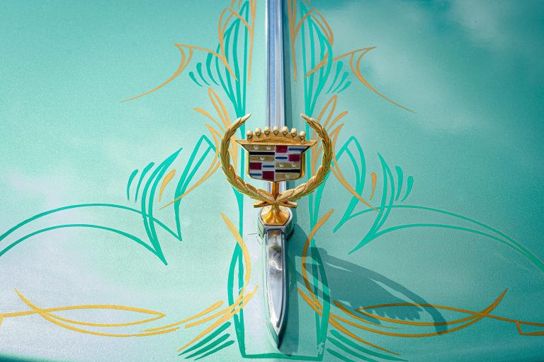
In some cases, logo changes can signify a shift in company direction. When Cadillac simplified its crest in 2014, it was part of a broader strategy to appeal to a younger, more modern audience. Understanding these motivations gives us insight into the strategic thinking behind car logo evolution, and how these companies are positioning themselves for the future.


